Zoe Sadokierski, University of Technology Sydney

Put simply, typography is the art of making language visible: designing what words look like on a page or screen.
Before desktop computing, typography was a specialised trade. Now, anyone with access to word-processing software can choose typefaces and layout documents. Yet access to tools doesn’t make one a craftsman. I can nail a few bits of wood together to make a serviceable table, but I am not a carpenter.
Effective typography is notoriously difficult to teach and learn. As a student I stared anxiously at my poorly designed pages, without instinctively knowing how to improve them. I recognise that same frustration in my students’ faces now. There is no quick fix. Typography is a painstakingly slow craft to master.
Which brings us to a problem. In an “age of distraction”, designing for long form reading requires thoughtfulness and skill. Yet putting typographic tools at the fingertips of untrained designers can lead to unreadable texts.
An illegible text is one that literally cannot be read – doctor’s handwriting, a book dropped in the bath. Unreadable texts are ones that you don’t want to read.
My aim here is to offer basic tips for designing long form texts in a way that encourages people to read them. More than making texts look good, my concern is making them readable.
For brevity’s sake, I’m writing about print design, but most of the points are transferable to screen design.
1. The Crystal Goblet approach
Designing a document with the reader in mind is an act of humbleness. It is not an opportunity for showmanship, experimentation or typographic trickery. There should be little evidence of the hand of the designer on the page.
Beatrice Warde famously uses the metaphor of a crystal goblet to explain that typography should be elegant but subtle, arguing the connoisseur of wine would choose to drink from a simple but elegant crystal glass over an exquisitely wrought gold goblet because “everything about it is calculated to reveal rather than hide the beautiful thing which it was meant to contain.”
Sadly for those of us who appreciate a pat on the back, an effectively designed text often goes unnoticed. That’s the point. The reader should be paying attention to the author’s work, not the designer’s.
2. Set appropriate margins
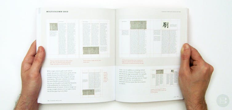
Always start by considering the page size of the final document. Find a page or existing book at that size and hold it. You need to get a sense of the size and shape in your hands. I cannot count the number of times I’ve heard a student say “it looked different on screen”. Yes. It does.
Considering the final page size, set margins for comfortable reading. For a book, the inside margin should be wide enough that words don’t fall into the gutter; if you have to crack the spine to read, it’s annoying. The outer margin should comfortably welcome the reader’s thumbs without obscuring the text; it’s distracting to have to move your hands while reading.
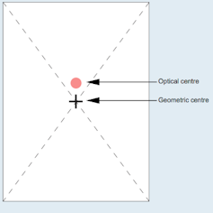
Set the bottom margin larger than the top. The optical centre of a page (where our eye hits first) is different than the mathematical centre.
If there is a running head or foot, the upper and lower margins should be adjusted accordingly so the flow of reading is not interrupted when you turn the page – you don’t want to accidentally read the book title as the next line of text.
3. Choose a (sensible) typeface (quickly)
Choose a typeface designed for long form reading, not a party invite. Don’t worry that a common typeface is boring. Familiarity is a bonus – the reader shouldn’t notice the typeface, the eye should move without distraction across the page.
You can lose hours of your life choosing typefaces. Ultimately, few people notice or care whether it’s Garamond or Jensen. After 10 years fussing, I now nominate a typeface a year (2013 was Fairfield, I’m currently shopping for 2014) which I use for almost everything, unless a task requires a particular look or special treatment. Two other typefaces I regularly use are:
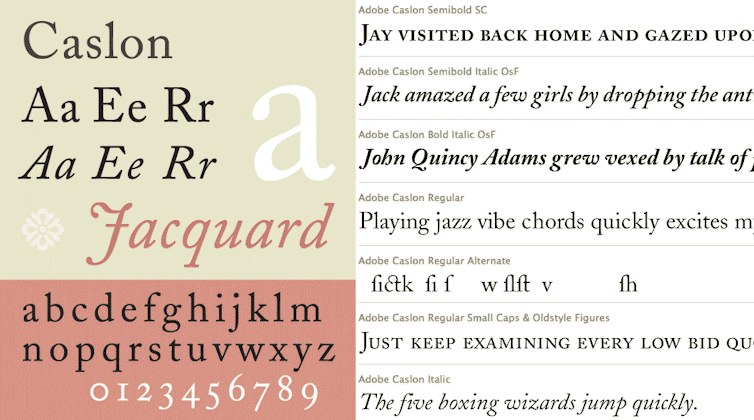
I strongly suggest selecting a typeface from the menu in your software program, or buying one from a site such as MyFonts or Font Spring. Designers spend years developing new typefaces, don’t steal them.
That said, thousands of free font sites clutter the Internet. Many of them are either stolen or badly designed. I use Font Squirrel, the available typefaces have been selected by graphic designers and are free for commercial use, though you still need to read the individual licences.
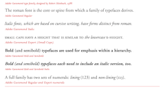
Choose a typeface with a family – roman (sometimes called regular), bold, italic, at the minimum. This allows you to add emphasis to words or italicise titles without having to change typefaces.
Small caps are helpful for running heads, chapter titles and other emphasis. Some software allows you to “force” italics, bold and small caps. Don’t do this. It can cause problems printing – these “forced” elements can fail to print, or cause unexpected spacing issues that distract the eye of the reader.
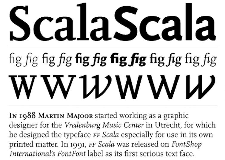
If you’re using multiple typefaces (remembering the Bauhaus adage: less is more), make sure they sit well together. Either choose a face such as Scala (above) with a sans serif and a serif, or choose two faces that are compatible. Test this by looking at two things – x-height and the shape of bowls:


4. Point Size and Leading
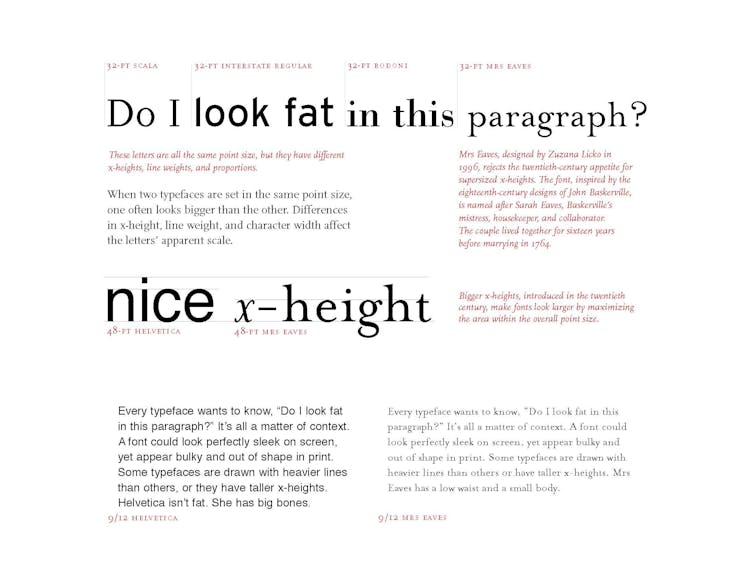
Point size is a unit of measure for the size of a typeface. Novels are usually set in around 12pt type. However, as US designer Ellen Lupton demonstrates below, different typefaces can be set in the same point size but look very different:
Leading, or line spacing, is the amount of space between lines of text. The relationship between the point size and the leading is ultimately what will make the text readable (or not). Too little leading makes the text dense and difficult to read, too much makes it difficult for your eye to find its way to the next line.
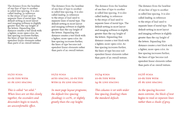
The only way you can tell how readable the point size and leading are when printed is to print it. Again, typography looks different on screen than on the page. Always test readability by printing the page to size. If you’re printing a page smaller than A4 onto A4 paper, cut it down to size. The margins will affect the way the text looks.
5. Test and refine
It’s important to show the pages to a few different people. A common mistake is making the point size too small, which is difficult to read or too large, which can make a text look remedial. It’s also important to sit down and read a long section of the text, printed at the final size. How a page looks and how a page reads are two different things.
Finally: look. If you want to learn to write, you have to read. To learn to design, you have to look. Go to your bookshelf, bookshops, libraries and examine books that appeal to you. Look at the margins, the typefaces, special features that appeal to you as a reader. Flip to the imprint page (before the title page, where the publishing information is) of books, they usually provide type specifications (typeface, point size, leading).
I reiterate that this post addresses key points to consider for designing texts, when the primary aim is to encourage people to read. I’m not addressing innovative typographic design, or the creative typography designers use as a strategy to engage a viewer’s attention. That level of typography can’t be addressed in a column, or even a book.
If you are interested in learning more, Ellen Lutpon’s Thinking With Type is the best typographic handbook I know. Look at the website but buy the book.
Anticipating eye-rolling or worse at quoting Warde’s Crystal Goblet essay, here’s a link to US designer Emily McVarish’s critique on the relevance of this to contemporary designers, from in Design and Culture.
Zoe Sadokierski, Lecturer, School of Design, University of Technology Sydney
This article is republished from The Conversation under a Creative Commons license. Read the original article.
