
Jo Jung, Edith Cowan University
The World Wide Web was invented almost 30 years ago by Tim Berners Lee to help people easily share information around the world. Over the following decades, it has changed significantly – both in terms of design and functionality, as well its deeper role in modern society.
Just as the architectural style of a building reflects the society from which it emerges, so the evolution of web design reflects the changing fashions, beliefs and technologies of the time.
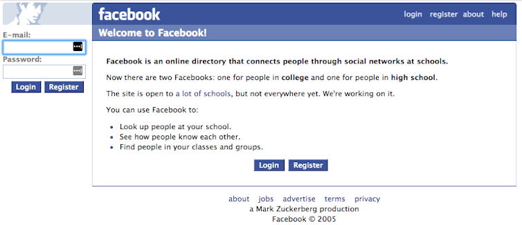
Web design styles have changed with remarkable speed compared with their bricks and mortar cousins. The first website contained only text with hyperlinks explaining what the web was, how to use it, and basic set-up instructions. From those early days to the present, web design has taken a long and winding journey.
Read more: Poor design means terrible websites still haunt the web
In the beginning
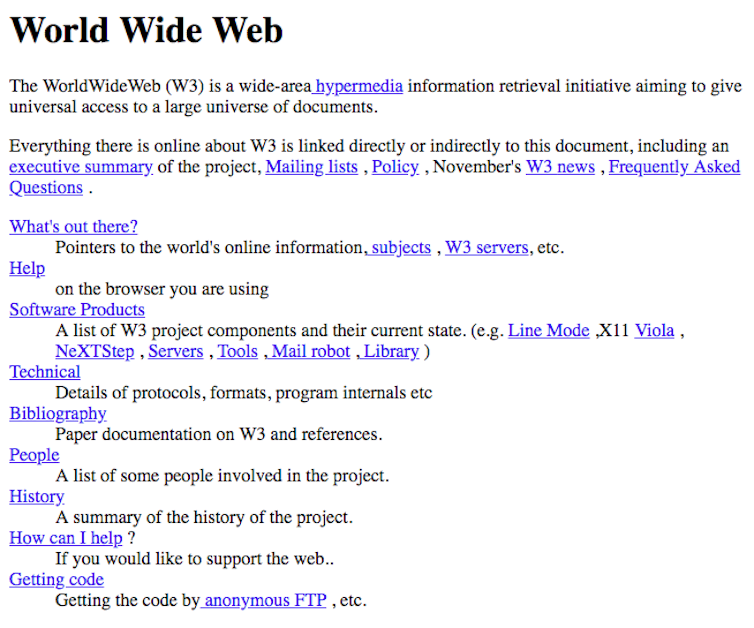
In the early 1990s, we welcomed the first publishing language of the Web: Hypertext Markup Language, or HTML.
But the language – used to share text-only pages via a simple browser – was limiting. Many early web sites were basic, using vertically structured, text-heavy pages with few graphics. People quickly adapted to vertically scrolling text and eye-catching blue underlined hypertext to navigate the virtual Web space.
Tables!
In the mid- to late-1990s, designers became more involved in the development of websites, and along came the Graphical User Interface (GUI), which allowed designers to incorporate images and graphical icons into websites.
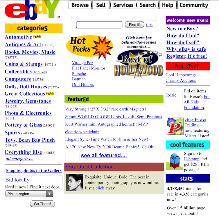
When the Web started to gain popularity as a means of communicating information, designers saw an opportunity to use tables for arranging text and graphics.

Before the introduction of tables as a web page structure, there were few design components in websites, and there was no way to emulate the layouts of conventional printed documents.
But while tables allowed designers to arrange text and graphics easily, the code required to build them was more complex than methods that came later.
Flashy design
In the late 1990s, a new technology appeared on the scene: Flash.
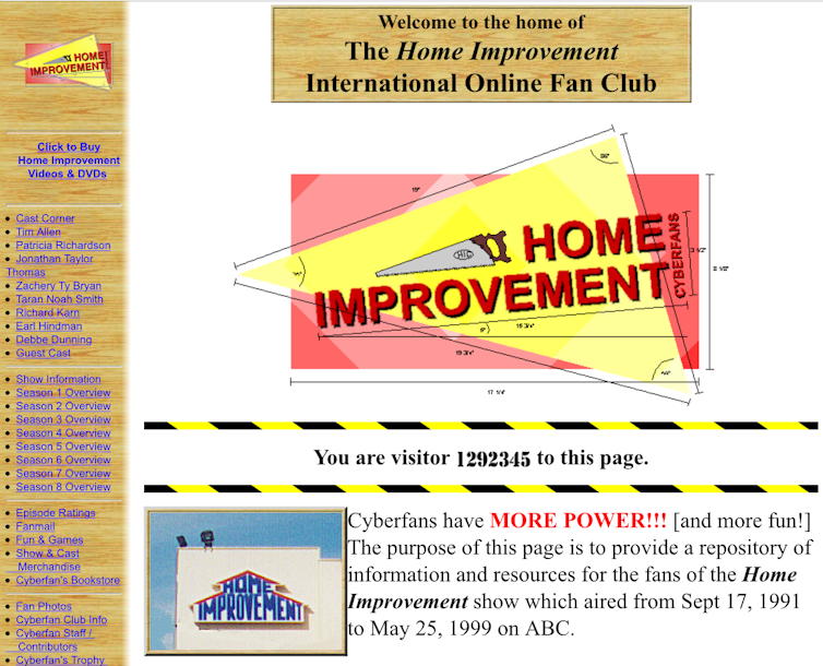
Flash was a software platform that allowed designers to incorporate music, video and animation into websites, making for a more dynamic audio-visual experience. Flash also gave designers more freedom to make websites interactive. This was indeed the era of a creative and technological breakthrough in web design. Interactive menus, splash pages, decorative animations, and beautifully rendered bubble buttons dominated the web design trend to wow people.
The concept of the Web was still new to many people, and these visually exciting designs had a double purpose. They were not only bright and attention-grabbing, but they also introduced unfamiliar technology to novice users: “Look at me”, they screamed. “I look like a real button. Press me!”
But the popularity of Flash was short-lived. It required users to have the latest Flash plugin installed on their computers, limiting the usability and accessibility of websites.
Read more: A new way to fix those frustrating websites
Everyone is a web designer
Although Flash didn’t live up to expectations, it changed the way websites were designed and used.
People became sophisticated at browsing the Web, and the design elements no longer had to educate in a way that visually articulates the functionality, such as blue underlined hyperlinks.
Then social media emerged and demanded even greater flexibility. This led to the birth of Cascading Style Sheets (CSS).
CSS were used to define particular styles – such as larger font sizes for sub-headings – across multiple pages of a single website without having to code each element individually. The idea behind CSS was to separate the content (HTML) of websites from the presentation (CSS).
Web design templates began to surface, allowing everyday people to create and publish their own websites. Unfortunately this was often at the expense of usable, accessible and aesthetically pleasing design.
Flat design
Fast forward to 2010 when a new web design approach called responsive web design was created by Ethan Marcotte. This introduced a different way of using HTML and CSS.
The main idea underpinning responsive design was that a single website could respond and adapt to different display environments, facilitating use on different devices. People would have the same experience on their mobile device as on their desktop computer, meaning increased efficiency in web development and maintenance.
This led to another wave of web design trend: flat design. This trend embraced an efficient and visually pleasing minimalist two-dimensional style. It emphasises functionality over ornamental design elements.
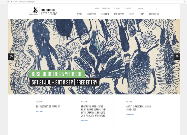
Today, flat design is still going strong. Web design has made a full circle back to the beginning of the Web, prioritising the content and the communication of information. Buttons and icons have taken a back seat, gracefully bowing to the content as the forefront of websites, and reduced complexity in design.
Read more: Google wants more mobile-friendly websites in its mobile searches
The future…
The history of Web is relatively short, yet it has gone through a succession of renaissances in a short period of time.
Previously, technology drove advances in web design. But I believe we are at a point where web design is no longer limited by technology. Virtually, we can do pretty much everything we might want to do on the Web.
The future of web design is no longer about what we can do, but rather about what we should do. That means being considerate about how design can affect the people who use it, and designing websites that result in positive experiences for users.
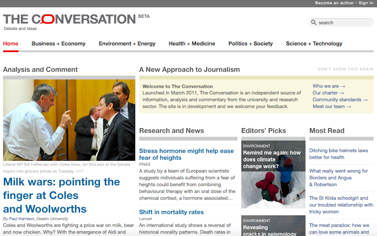
You can look up previous incarnations of your favourite website using the Wayback Machine.
Jo Jung, Lecturer, Edith Cowan University
This article is republished from The Conversation under a Creative Commons license.
Read the original article.
